

Google Contacts’ Material 3 Redesign Is Absolute UI Overkill You Didn’t Ask For
Hello everyone. Today, we’re going to talk about something absolutely riveting – or at least Google wants us to think it is. Google Contacts has been slapped with the Material 3 “Expressive” redesign, and I must say, if there was ever an example of polishing a button on the elevator to a basement that no one wanted to go to, this is it.
Contacts in Boxes: Because Flat Lists Were Apparently Too Revolutionary
So here we are, staring at contacts that are no longer in a simple list format. Nope, that might’ve been too clean and efficient. Instead, we now have “containers” around each contact. Containers! Because nothing screams modern design like forcing your eyes to hop around little boxed-off rectangles to find the one number you actually care about. It’s the UI equivalent of putting your groceries into three bags, then putting those bags into another larger bag, and congratulating yourself on being organized. Spoiler: you are not.
If you’re on the “Highlights” or “Organize” tabs, congratulations, you’ve essentially won absolutely nothing. Those tabs look almost the same. The “Create contact” page? Untouched. Marvelous. Revolutionary. A design team clearly earning its salary through bold decisions like… doing nothing.
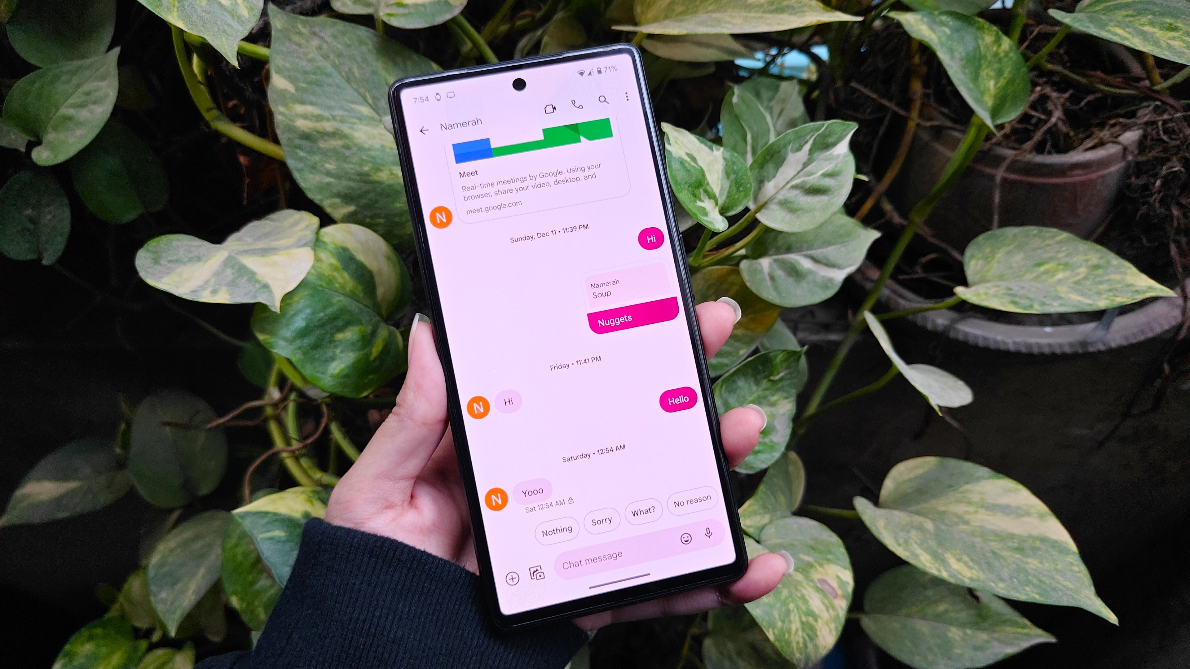
The Contact Info Page: Pill Shapes, Because Squares Are Oppressive
The icons for call, message, video, and email are now larger and pill-shaped. Wow, pills – as if Google wants you to swallow the design like a horse tablet every time you need to make a phone call. They’re easier to tap? Sure, but were square icons really the Dark Souls boss battle of phone navigation that we’ve been pretending they were? No. But hey, it looks vaguely modern and aligns with the rest of Google’s Material 3 dribble, so here we are.
Oh, and the “Contact info” label above the phone number? Gone. Because clearly, that line of text was the straw breaking humanity’s psychological back. Thank you, Google, for removing unnecessary words. A great leap forward worthy of standing ovation – or, and hear me out, a slow clap that transitions into a yawn.
Incoming Call Screen: Now With “Personality”
Now here’s where it gets spicy: Google is testing customizable calling cards. Oh yes. You can finally have a massive, full-screen image of your caller take over your device, with fonts and colors because apparently, it wasn’t distracting enough already. You think spam calls were bad before? Wait until every unknown caller smacks you with a full-screen neon puke green “Scam Likely” because the customization options got out of hand.
It’s like handing your phone’s UI the keys to a Las Vegas neon sign factory – absolutely nothing could go wrong.
And let’s not forget, Apple’s been doing this forever on iOS. As usual, Google is arriving late to the party like the guy who shows up after everyone’s gone home and tries to convince you that his lukewarm takeout pizza is worth sticking around for. Better late than never? Perhaps. But when the execution is as half-baked as always, forgive me for not setting off fireworks.
The Beta Trap and Rollouts of Doom
Of course, not everyone will see these changes right away. Things are rolling out with specific app versions – because Google apparently loves torturing its users with “maybe you’ll get it, maybe you won’t” lotteries. So the new contact containers, pill-shaped icons, and customizable calling cards are being drip-fed like an MMO with the worst loot box system imaginable. You open your app update and pray you’re part of the chosen few. Congratulations, you’ve just experienced the real “endgame raid” of Android: UI rollout roulette.
Doctor’s Note
As a practicing sarcastic physician of bad UI design, I diagnose Google with Chronic Feature Inflation Syndrome. Treatment: minimalist UI design and a heavy regimen of not fixing what isn’t broken.
Conclusion: A Reskinning Nobody Asked For
Here’s the truth: this entire thing is a fancy coat of paint on a utility app that already did its job just fine. Contact apps don’t need to be reinvented monthly like Fortnite skins. They need to be fast, clean, and practical. Instead, what we’ve got is another design pass pushed out the door to keep Material 3’s branding alive. Yes, it’s prettier, yes, the pills are tap-friendly, and yes, you’ll maybe add a cringe-worthy full-screen image of your cat to your spouse’s calling card. But ultimately, did this need to happen? No. It’s flash over substance, style over necessity. The conspiracy theory side of me whispers that Google’s real play isn’t aesthetics at all – it’s data collection hooks hidden conveniently in “create calling card” prompts. Mark my words.
Final verdict? Mildly interesting at best, bloated nonsense at worst. Certainly not a game-changer, just another incremental shuffle in Google’s eternal crusade to pretend superficial updates equal meaningful innovation. But hey, if pill-shaped buttons and boxed-in contacts make your heart sing, who am I to rain on your Material 3 parade?
And that, ladies and gentlemen, is entirely my opinion.
Source: Experience the new material 3 design in Google Contacts: What’s changed?

