


Google Photos Editor UI: The Worst Update You’ll Ever Regret
Hello everyone. Today’s diagnosis? Google has taken its Photos app, slapped a party hat on it for its 10th birthday, and gifted us a user interface that manages to be both more complicated and less functional. Imagine showing up for what’s supposed to be a delightful birthday celebration-cake, balloons, minimal effort required to enjoy yourself-only to find out Google’s idea of fun is forcing you to solve a Rubik’s cube blindfolded before you can even eat. Congratulations, it’s not a party; it’s a test of your patience.
The New UI: Clutter Masquerading as Innovation
So apparently, users around the Pixel subreddit have been reporting the new Photos editor is downright “unusable.” That’s not me exaggerating for dramatic effect. That’s the actual word people are using, and oh boy, it’s accurate. The central complaint? The UI is cluttered to high heaven. A mess. A digital junk drawer where every tool is crammed together but nothing is where you need it. If you thought you could make a quick touch-up and get on with your day, too bad. Google’s new design philosophy seems to be: let’s make sliders that require a PhD in finger gymnastics just to adjust brightness by 5%.
Your editing screen is smaller, sliders demand tapping in and out like you’re grinding for pointless side quests, and changes don’t even highlight properly. Translation: there’s no quick way to tell what you just did, so unless you’ve got photographic memory or actually documented your steps like an obsessive lab technician, you’re stuck guessing. This is UI 101, violated in broad daylight. And yes, we’re all paying the copay on this diagnosis with our time and sanity.
From “Rapid Edits” to a Marathon of Misery
The previous version of Google Photos wasn’t perfect, but it was minimal. Minimal, in design, is often good. It’s like surgery: fewer incisions, fewer complications, fewer ways to bleed out on the operating table. Old Photos had a single panel where you could make rapid edits without hopping through endless menus. The new version? No such luck. Now you’re forced to swipe through enlarged sliders like you’re flipping through a badly designed RPG inventory menu. Oh, look, brightness is hiding behind contrast which is hiding behind shadows, which is of course tied to stamina because why the hell not?
“Rapid edits with one panel and a tap of a button? Not anymore. Now it’s find-the-slider roulette.”
The result is an “upgrade” that actually downgrades workflow efficiency. It’s like installing a mod in your favorite PC game that promises quality-of-life improvements but instead deletes your save file and spawns you in Minecraft with no inventory. Brilliant. Truly visionary work, Google.
The Crop Corners: Losing Space for No Reason
Users also took aim at the new crop corners. You know, those intrusive little UI elements hogging half your screen real estate while serving no actual purpose. Losing visual space during editing is about as helpful as a surgeon losing their scalpel mid-operation. Imagine trying to fix a picture while only seeing 75% of it because Google decided an abstract geometry lesson was more important than you, the user. Yup, 10 years of development and the big reveal is… less space to see your photo. Bravo.
AI-Powered… Annoyances?
Google tried selling this redesign with promises of “AI-powered suggestions.” I can see the corporate PowerPoint now: stock images, big bold words, and maybe a cat photo edited with AI filters to look “innovative.” In real-world usage, though, all this AI flair doesn’t solve the glaring usability problems. Being told where to adjust your photo while wrestling with a UI that’s slower than Dark Souls’ first boss fight with no armor is pointless. It’s like a con artist distracting you with shiny objects while shaking your wallet empty-flashy, but utterly infuriating.
When Nostalgia Becomes the Smarter Option
Some users are outright requesting the rollback to the old UI, and honestly, who can blame them? Why celebrate a milestone by setting your app on fire? It reminds me of conspiracy theories where companies deliberately ruin user experiences just to herd people toward premium alternatives. Wouldn’t it be convenient for Google if the frustration drove some hapless folks into paying for higher tiers of editing apps? Coincidence? Or is it Galaxy Brain corporate design logic? I’ll let you draw your own conclusions, but let me just say this: never underestimate the creativity of a trillion-dollar company looking for new streams of revenue.
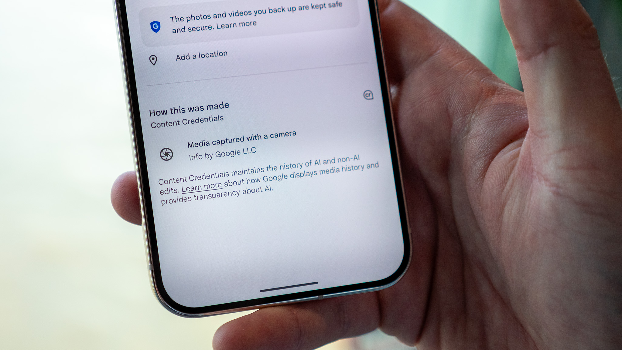
The Secondary “Gifts”: QR Codes & Refined Menus
Ah yes, the consolation prizes. Don’t like the editor? Well, at least you can now share albums with QR codes-as if that was some radical leap forward in human progress. Funny, isn’t it? For an app born from simplifying how we interact with photos, Google somehow figured out how to make editing harder but sharing a bit easier. Also, iOS users got a slightly refined action menu and “glanceable” info, while Android users were told they might get it later. That’s right, the Android faithful are again treated like the beta testers they never agreed to be. Fair treatment right there, ladies and gentlemen.
Final Diagnosis: Good Intentions, Catastrophic Execution
At its core, this is a lesson in how not to handle UI design. You don’t take away functionality and expect users to embrace it simply because you added AI buzzwords and a milestone celebration banner. If the Photos app was a patient, I’d put it in critical condition: bloated from over-design, suffering from oxygen deprivation courtesy of crop corners, and dangerously unstable thanks to its clunky slider system. The prognosis? Unless Google listens to its user base and patches the hell out of this disaster, the Photos app editor is on life support.
Overall, the impression of this redesign is overwhelmingly bad. Functionality tanked, workflows slowed, and the only positive is… what, QR codes? This entire update reads like a boss battle that nobody asked for, where the reward for winning is a UI that still doesn’t work well. If you’re asking me? Skip the celebration. This is not how you treat a decade-long legacy. Verdict: Bad. Very bad.
And that, ladies and gentlemen, is entirely my opinion.
Article source: Users are dreading the Google Photos ‘less functional’ editor updates, Android Central
